My First submission is actually a compilation of maps that I had made previously, that I have since reworked to fit within standard cartographic conventions.
Lab1
Map 1 - Qualitative Map of Dominant Racial Groups in Buffalo, NY (Per Census Tract)
• Resized the map body, made source information smaller, adjusted the size and increments of the scale bar, chose a more appropriate north arrow, adjusted the outlines size of the counties, added an appropriate neat line, and made the title: bold, underlined and larger. Also removed the phrase “Dominant Race” from the legend and added a subtitle.
*Note* This map is intended for a general audience, the inclusion of red and green together in the same map, may cause some confusion for those suffering from colorblindness.
Map 2 - Quantitative Map of the percentage of the population ages 18-21 in Buffalo, NY (per census tract)
• Resized mapped area to be much larger, adjusted the thickness and color of the outline of each census tract to help differentiate between values, adjusted color scheme to be more clear, added a new legend with more clear values after reclassifying the data by natural breaks and standardizing pop_18-21 by total population instead of calculating a separate attribute field like before. Finally I adjusted the title size, added an accurate scale bar, removed the background color, made the north arrow smaller, created a smaller subtitle, and added information on how the percentages were calculated.
Map 3 - Multi-Datalayer Map of the Shrinkage of Nezpierce Tribal Land after 1855
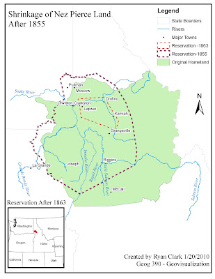
• Resized the map area to fit within the margins, added projection info to the source material, removed the word “legend” from the legend, added a scale bar to both the map and inset, and added a neat line to the map area.
Map 4 - The Effects of Generalization on Idaho Rivers
• Couldn’t quite figure out a way to show the majority of rivers and maintain enough definition for the audience to tell what was going on, so I decided to use one close up portion of a river segment that exhibited the largest difference between the three methods. I greatly enhanced the size of the mapped area, swapped the page layout to landscape, increased the size of the map inset, adjusted the thickness of the river lines and chose more appropriate colors. Overall this is my least favorite map, it really doesn’t exhibit any of the qualities a proper map should, there is too much white space, no real audience except my professor, no real purpose except for demonstrating the effects of generalization, and no aesthetic appeal.
Lab2
Map 1 - The Boulder Colorado Area (My First Attempt at Adobe Freehand)
• Resized the map area to be much larger, made the title much larger and visible, eliminated the guidelines from the final map, sent the Boulder National Park area to the background so that the roads were visible, created a legend and north arrow, filled in the rest of the parks with the appropriate color of green, and adjusted the margins of the output so that certain features were not cut off. The margins are still a bit of an issue, because I can’t get freehand to include all the features, it tends to adjust the margins of the output to the edges of the largest features on the map.
Lab 3
Map 1 - Quantitative Map showing the effects of various Data Classification Methods
• I resized all of the mapped areas so that they filled more of the screen (less white space), dropped the titles for each example within the boarders of the mapped areas to make it more clear as to which map went with which classification method, made the title larger and removed the underscoring from it as well as added a subtitle, adjusted the values in the legend to reflect actual percentages, adjusted the colors and boarders for each legend element, added individual north arrows to each mapped area, enlarged the scale bar, eddited the source information and adjusted the overall layout.


